I'm a Contemporary Artist—These 40 Nordstrom Items Are as Chic as It Gets
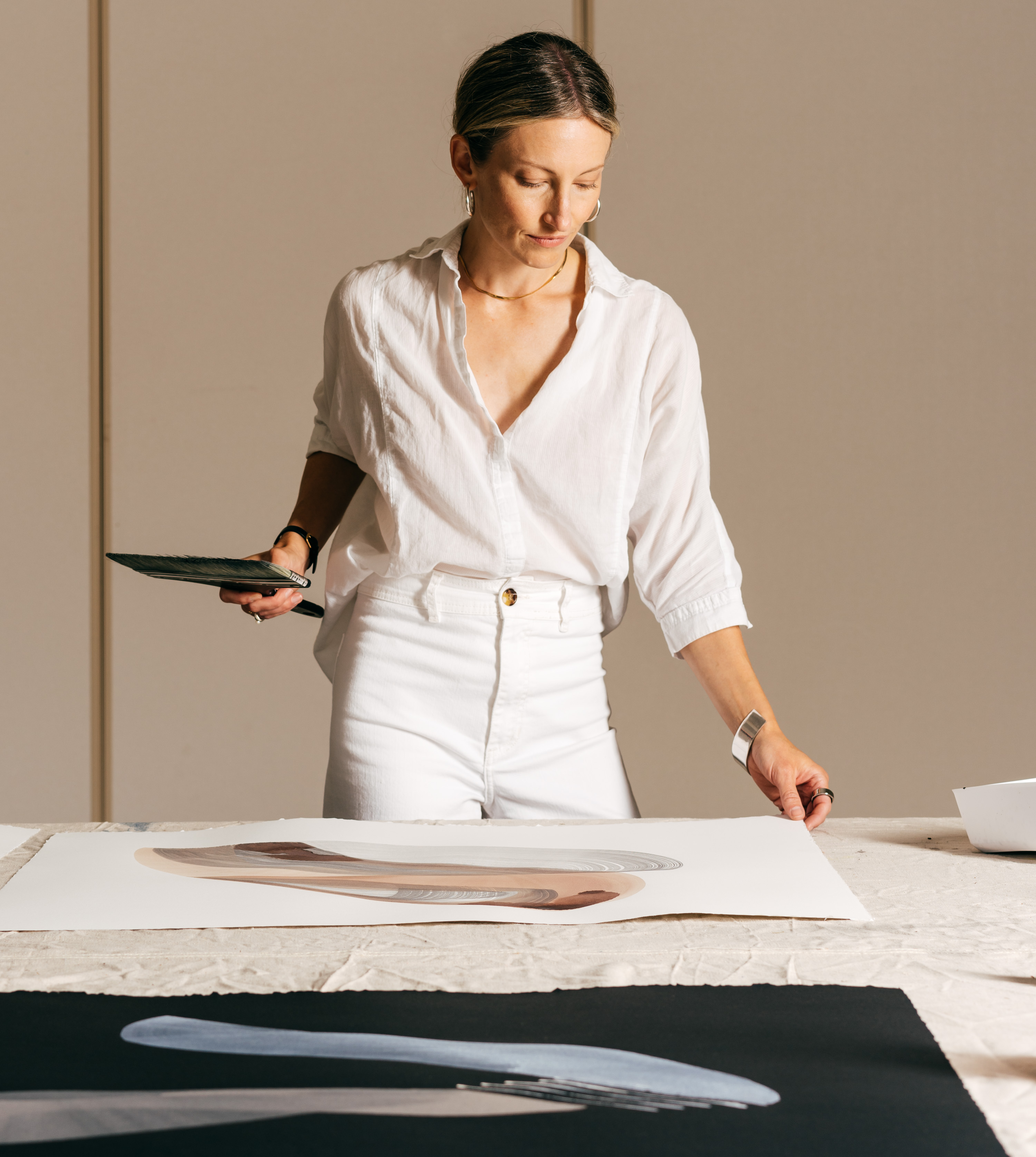
Photo:
Emma K. Morris
"I reach for a white tailored shirt constantly. This oversize fit allows for a deep-V neckline, worn slightly pushed back on the shoulders."

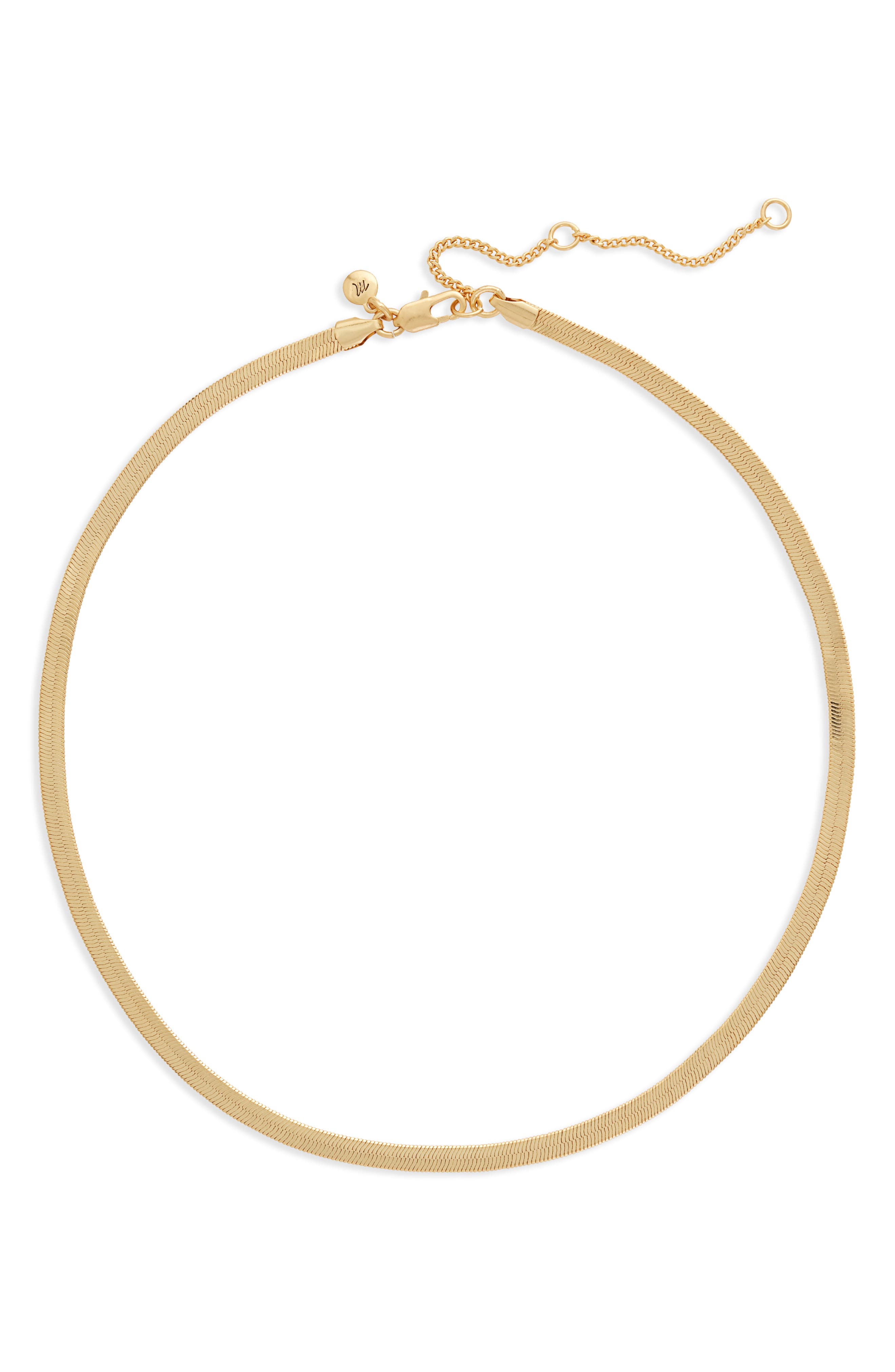
"Mixing metals lends subtle complexity to a monochrome look without competing against it."
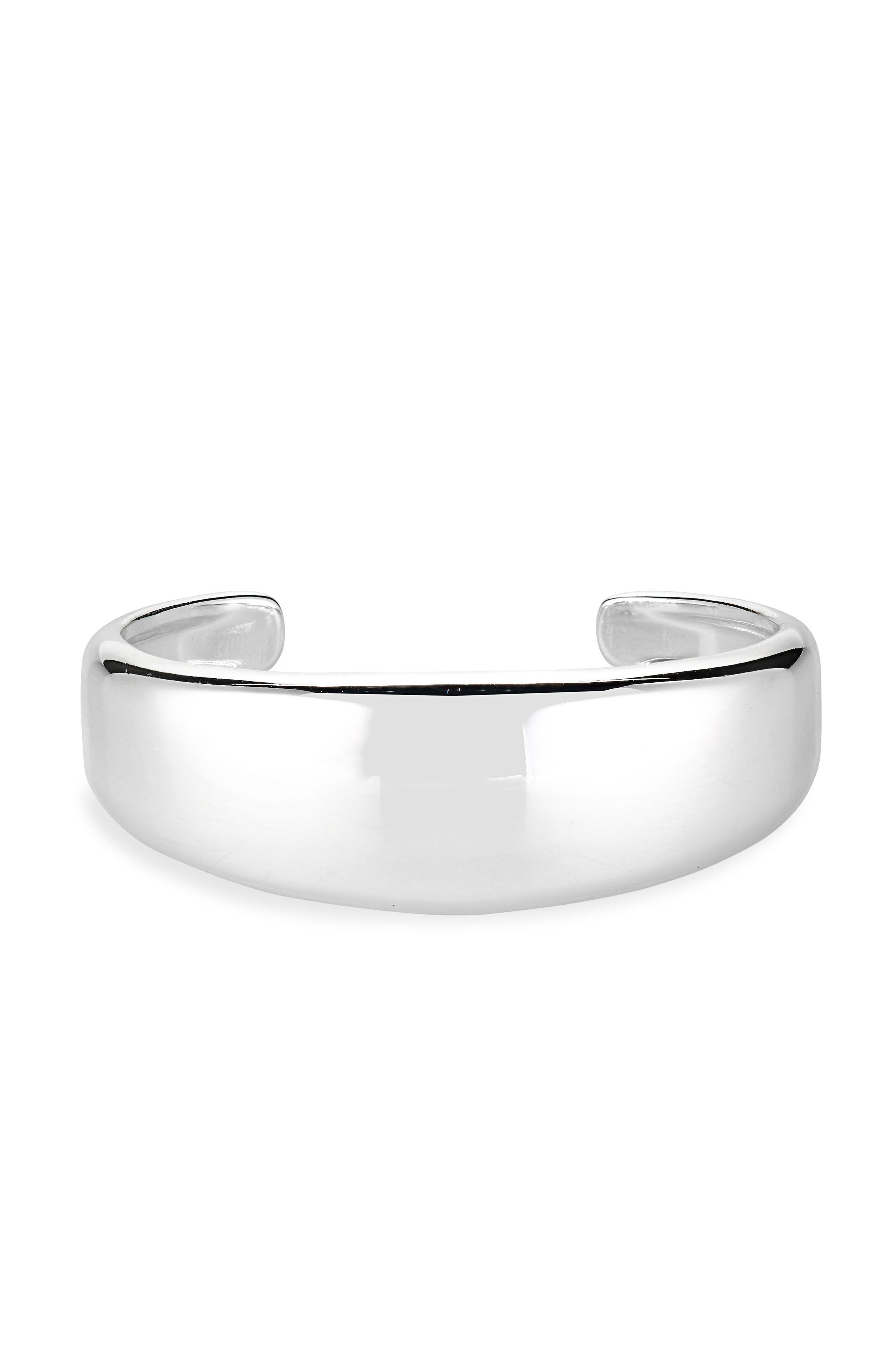
"A wide silver cuff is a signature sculptural element that I often wear."
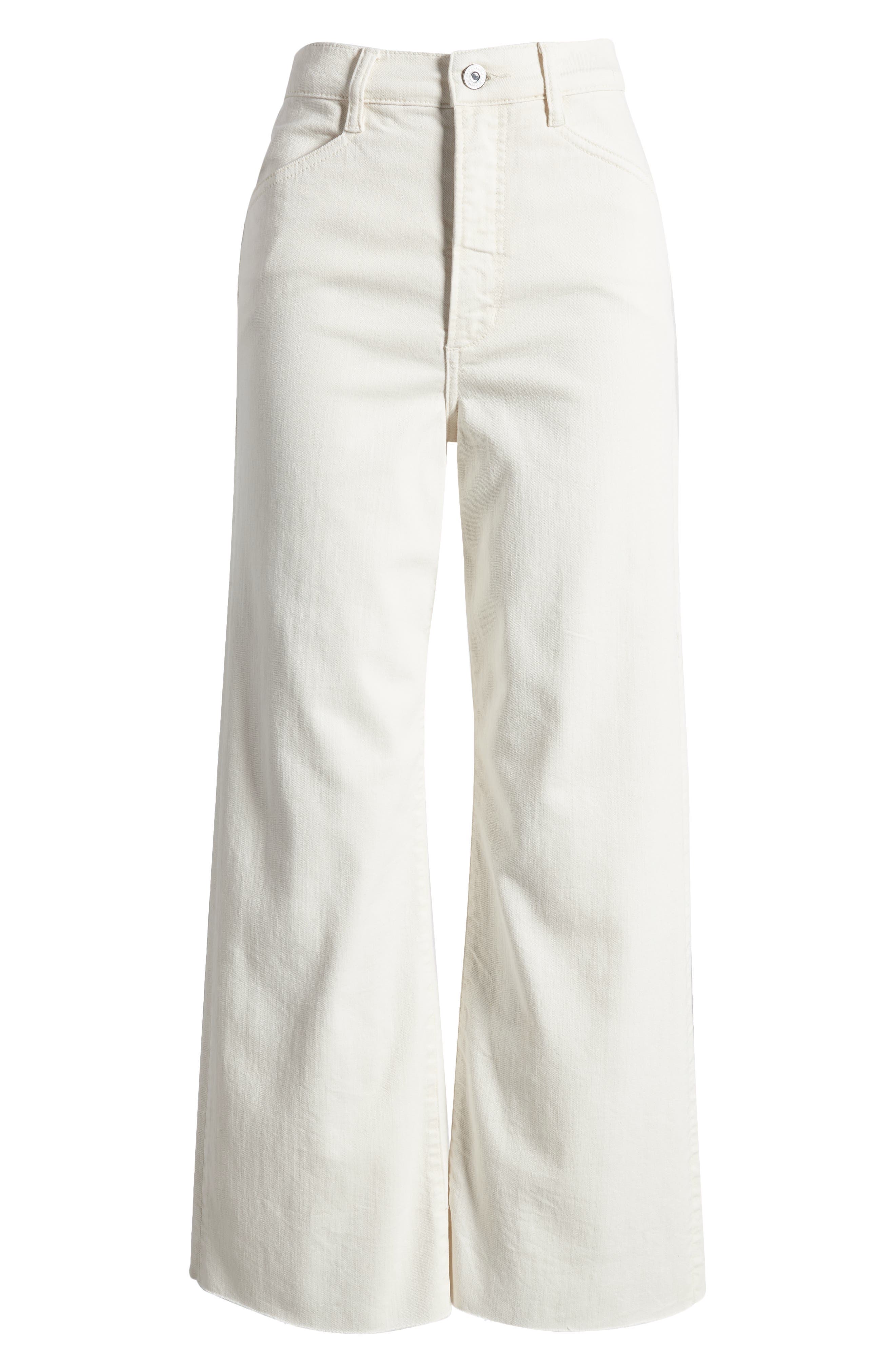
"The wide leg and nipped-in waist create an hourglass shape with a shirt tucked in."

Photo:
Tiffany Joy Photography"My choices tend to veer in two directions: either similar tones punctuated by a contrasting color or a multi-hued palette of colors with neutral undertones. I gravitate toward colors that calm and clarify my senses. For me, that means colors derived from the natural world, including black and white."

"Watery tones are my Piscean way of whispering color. My William Frederick coat is sold out in this color, but this version is a similar pale aqua."

"This olive color is so beautiful in person. It has almost a golden undertone, and the mixed-width ribbing feels sumptuous."

"The former ballerina in me loves a classic wrap sweater. The gray undertone neutralizes the blue and makes it endlessly wearable."

Photo:
Laura Naples Studio
"Burgundy is a color that I've been working with for about a year. When I paint with this color, I feel enveloped in warmth and serenity."

"If I wanted to feel like I was inside a painting, I would wear this silk habutai shirt."

Photo:
Laura Naples Studio
"When I mix paint colors, I will often add in pale lilac for a bit of depth, brightness, and complexity."

"The softness of this green would pair beautifully with the hem of a black pant. I love to paint this color against a black background."

"Gradient colors that merge into one another appear frequently in my work, and I love the application on the organic shape of these bowls."

Photo:
Laura Naples Studio
"At home, I display blush glassware on open shelves to appreciate the color and craftsmanship. Estelle Colored Glass makes the best colors."

"The chocolate silk is delicious, and the cutout line that runs from the front all the way to the back lends nuance and interest."

Photo:
Tiffany Joy Photography"In my work as an artist, texture can be the inspiration that drives decisions as a work evolves. I love to create gradient textures with diluted acrylic paint, guiding pigment deposits across the paper or canvas by tilting the surface.
"I'm fascinated by organic, ragged textures that occur when I introduce additional water. As the paint dries, I'm rewarded with a myriad of textural surprises. I'm partial to anything pearly, metallic, or iridescent, especially when offset against soft, rich knits or linear, woven textures—both rough and smooth.
"Lately, I've been experimenting with translucent materials like vellum and Mylar. I think this references my early childhood when I wanted to be a ballerina; I loved all the chiffon, nylon, and tulle that would allow me to see the movements of the dancers underneath."

"A soft organic cotton tee with a perfect drape that I often reach for when wearing a high-rise pant."

"The black suede recedes while the shiny silver leather stripes float forward, making these classic Gazelles extra dynamic."

Photo:
Arden + White Gallery
"Brushed softness and refined structure integrate in this sweater."

"Composing a painting of varying textures is a balancing practice, like the combination of pearl, silver, and gold tones in this beautiful watch. Each stands alone yet complements the other."

"Tonal dressing—or painting—begs for textural juxtaposition. This 'gently rumpled' skirt with a sheen would offset knit or woven textures."

Photo:
Laura Naples Studio
"The pale color highlights the textural qualities of the faux leather, drawing the eye to the seams that compose the structure."

"I sometimes use iridescent pigments in my artwork to make the painting appear lit from within. I use this highlighter stick to create a similar radiant effect on the top of my eyelids and cheekbones."

Photo:
Uprise Art
"Blazers are essential for dressing up my jeans-and-tee uniform. The satin of this version radiates in vibrant tension with the tailored shape."

"A bold silver band on my ring finger is a staple. When I hold or gesture with a paintbrush in my hand, it catches the light."

"Texture informs the items I bring into my home as much as what I wear or paint in the studio. I imagine reading under this alpaca throw on my sofa in the evening."

Photo:
Laura Naples Studio
"I wear T-shirts and jeans frequently when working in the studio. The smocked texture of this tee creates a flattering corset effect."

"Composing a painting of varying textures is a balancing practice, like the combination of pearl, silver, and gold tones in this beautiful watch. Each stands alone yet complements the other."

"Like many artists, I seek an operational flow state. To cultivate that way of being, I'll sometimes wear flowy versions of my favorite shapes, like these drapey trousers."

Photo:
Laura Naples Studio"I often think of sculptural forms when I'm painting, whether irregular shapes found in nature or hard-angled geometries. I'm interested in the tension between different forms and look for alignments between them to create a sense of balance.
"When dressing or choosing items for my home, I find pieces that remind me of sculptural forms, and I pay attention to how their proportions and lines play off each other. For me, accessories and jewelry can be a place to play with whimsical or bold shapes. I actually sometimes sketch pieces of jewelry I'd like to find or make, and the shapes in these sketches also find their way into my paintings. Again, it's all integrated."

"A sculptural take on a tee. The crossed panels layered over the base emphasize the bustline, accentuate the waist, and create the illusion of a corset shape."

"Circles and oblong shapes are everywhere in my work. These are simple enough to wear every day but an interesting alternative to a classic hoop."

Photo:
Design Within Reach
"I was drawn to this piece like a magnet. The irregular form encased within the angular translucent box looks like found treasure."

"Classic tailored denim is given a novel take on form with front pleats, like the depth created by layering painted shapes."

"The curved ends of this cuff echo the linear forms I create on paper and canvas with foam brushes and diluted acrylic."

Photo:
Laura Naples Studio

"The graceful form of this pointed-toe loafer is accentuated by the contrasting leather panel."

Photo:
Laura Naples Studio

"I adore the lines of this belt! I could imagine it styled countless ways, especially to break up contrasting monochrome looks."

"The signature folds of this bag remind me of origami and the angled and curved shapes I like to paint."

Photo:
Laura Naples Studio
"Form does not always have to be exuberant. Restraint can offer balance, as exemplified by this lamp, which would beautifully offset a curved chair or sofa."

"Whether painted or worn, curved plus straight lines create shapes that generate interest when positioned together."